Intake Funnel Optimization Yields 20% Growth
Healthcare scoring systems implementing trust-centered layouts and optimized data-input logic to capture user medical intent.
The Context & Challenge
Within a specialized healthcare platform, the legacy interface lacked the clinical authority and structured visual hierarchy required for medical data collection.
In the high-stakes environment of neuropathy treatment, the interface utilized generic UI patterns that bypassed the established Design System. This "generic form" aesthetic caused severe user friction, as patients dropped off due to a lack of immediate trust signals when asked to share sensitive medical histories.
On mobile viewports, dense layouts and inconsistent input styles amplified cognitive overload, making the medical onboarding quiz feel overwhelming and decreasing the product's perceived value.
The Strategy
A estratégia transformou a experiência do produto, mudando o foco de uma coleta de dados intrusiva para uma orientação clínica ao usuário. O objetivo principal era injetar autoridade imediata de marca e otimizar o fluxo de conversão.
Utilizando a biblioteca base da marca, o design system foi aplicado de ponta a ponta no funil. A reconfiguração estratégica substituiu fundos pesados por uma hierarquia visual sofisticada de padrão médico para otimizar a leitura no mobile.
Essa mudança estrutural buscou unir a conveniência digital à confiabilidade clínica, padronizando elementos de interface para facilitar futuros testes A/B rápidos em variações do quiz.
The Execution
The execution translated the clinical strategy into production-ready mobile interface components.
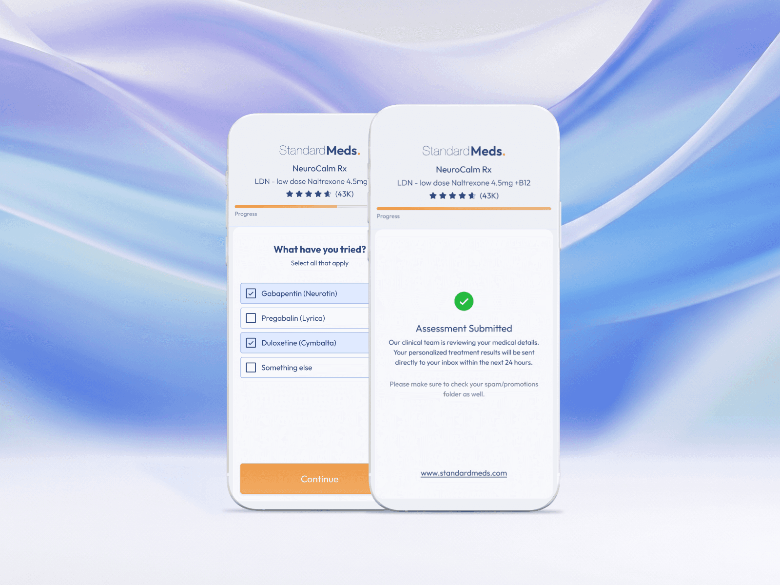
Prominent industry-standard trust badges and verified ratings were integrated directly into the global header layout, establishing instant credibility.
Form fields, inputs, and button affordances were redesigned into a clean, high-readability layout. This reduced cognitive overload on mobile viewports and converted a standard form into an intuitive, high-converting medical assessment.
Success screens were restructured to deliver a tailored feedback architecture. This transition from a generic confirmation page to a personalized diagnosis presentation drastically increased user investment and lead quality.
To eliminate fragmentation, every component was mapped directly to the corporate Storybook repository. This design-to-code synchronization established an explicit documentation workflow, eliminating visual regression and reducing implementation overhead for the engineering team.


The Outcome
Increase in Quiz Completion Rates
in front-end development time due to Storybook sync.
Improved Lead Quality:
High-trust environments generated a significant increase in accurate medical history reporting.